Asset Recommendations For Your Marketing Campaign
If you're getting ready to run social media ads for your campaign (either by using BackerKit Marketing or on your own), the marketing assets (images and video) you use can make a huge difference. Here are our requirements and recommendations:
Skip to:
- General Requirements
- Tabletop Games
- DnD 5E & RPGs
- Tarot
- Artbooks, Comic Books & Graphic Novels
- Video Games
- Miniatures, Terrain, and STLs
- Dice
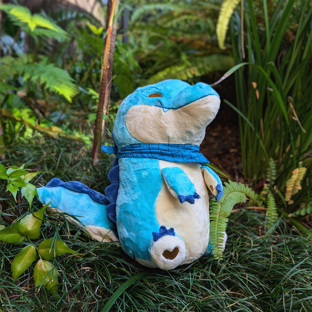
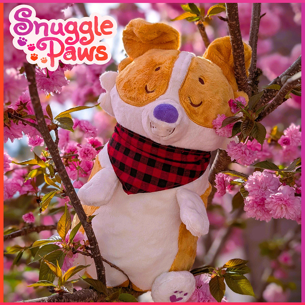
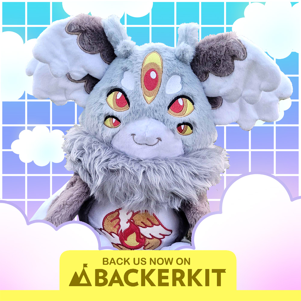
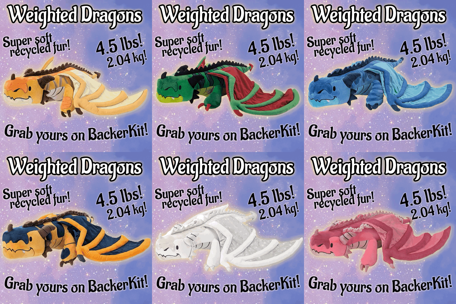
- Plushes
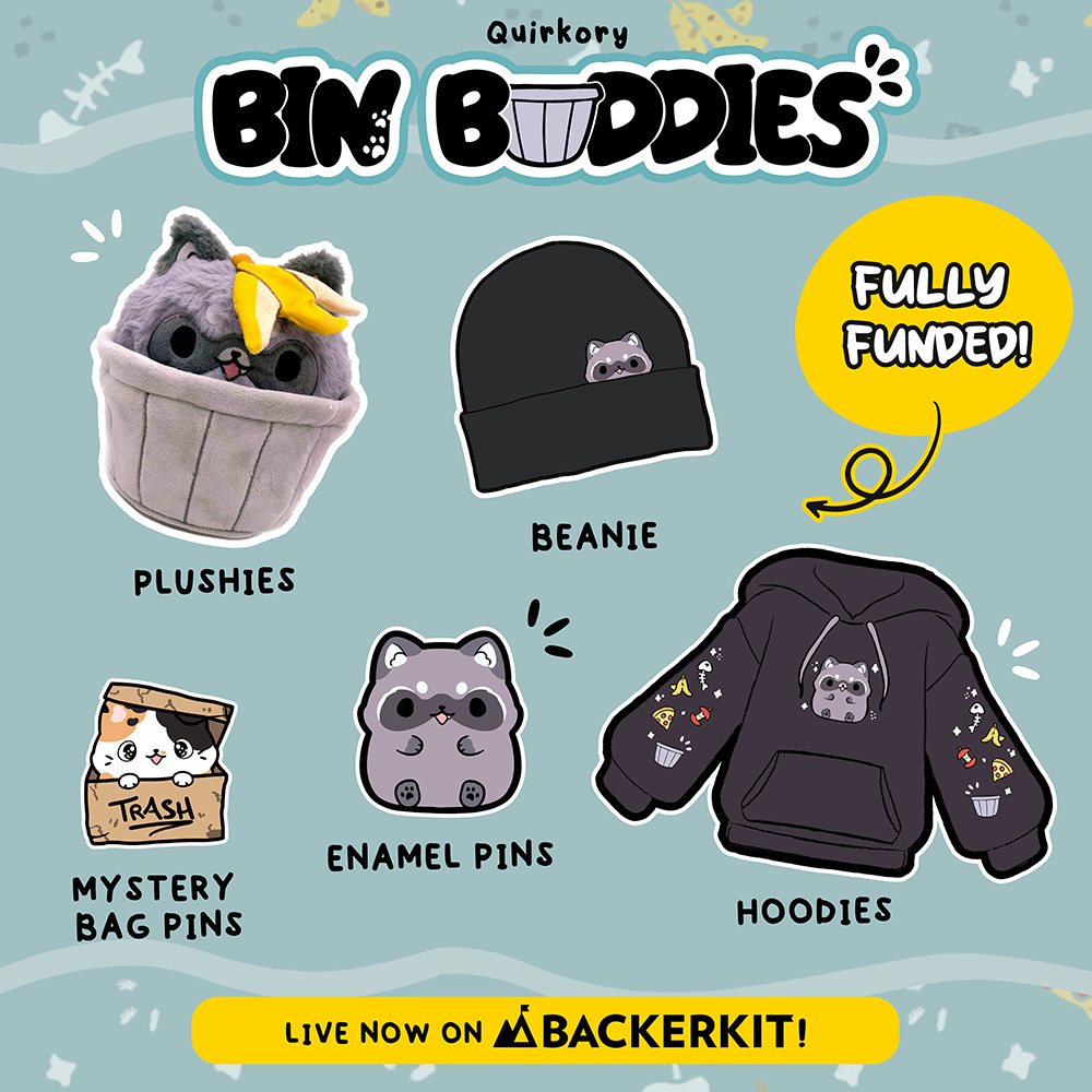
- Enamel Pins
- Product Design: technology, EDC, apparel, fitness
- Additional Info
General Requirements
Facebook allows us to test 10 different assets at once so we suggest you put together a mix of at least 10 images and/or videos that showcase your project best. We expect the assets you provide us to be ads-ready meaning we will not assist with creating any assets using raw .png files of the renders etc.
Image
| File Types |
.jpg or .png (we do not accept raw .PSD / photoshop files at this time) Max size of 5mb |
| Sizes |
Formats (at least one of each preferred)
|
Video & GIF
| File Types | .mp4 or .MOV |
| Sizes |
Preferred Square 1:1 (1080 x 1080px) Landscape (1200 x 628px) Vertical (1080x1920px) - for Instagram Reels & TikTok |
| Max File Size | No larger than 1GB |
| Video Length | Videos/GIFs need to be a minimum of 15 secs and max 3 mins; recommended length is 1-2 mins |
Other notes to keep in mind if you're using our marketing services:
- When using BackerKit Marketing, we emphasize quantity AND quality. Here are a few reasons why:
- Because we curate the images on our side, we like to start with a minimum of 10 images and/or videos.
- Oftentimes the best-performing assets are a surprise and counterintuitive.
Whether you're using BackerKit Marketing or striking out on your own, the following is important to keep in mind:
- The best images often strike a balance between explaining and teasing the product.
- It is NOT the objective of images and ads to close the sale. Rather, it’s to entice the right person to click through as quickly and spontaneously as possible. The sell/close happens on your Kickstarter page. Trying to be too comprehensive or explanatory in the assets can backfire for the following reasons:
- Every split second that end-user ruminates on image/ad adds a huge drop-off in click-thru probability.
- Trying to over-explain could give the end-user one “no” reason too early. End-user might make a quick no decision before getting to the Kickstarter page.
We hope this helps! If you have any questions, feel free to contact your BackerKit account manager.
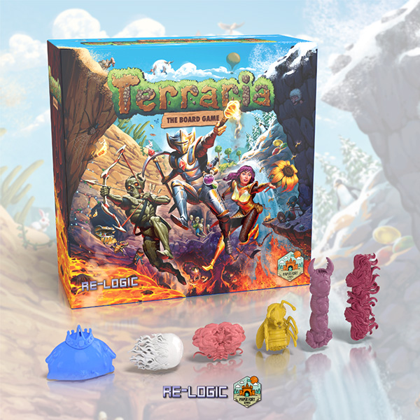
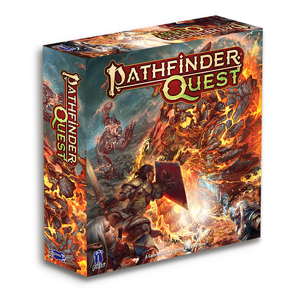
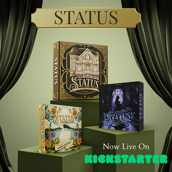
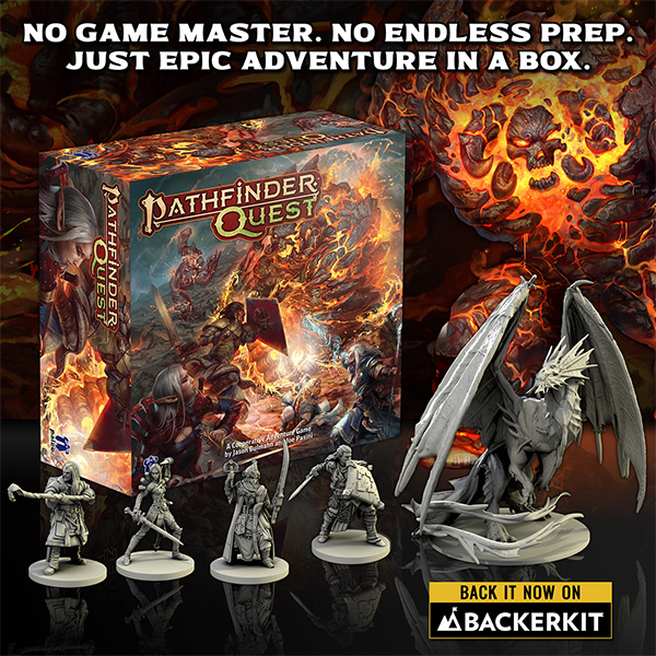
Tabletop Games
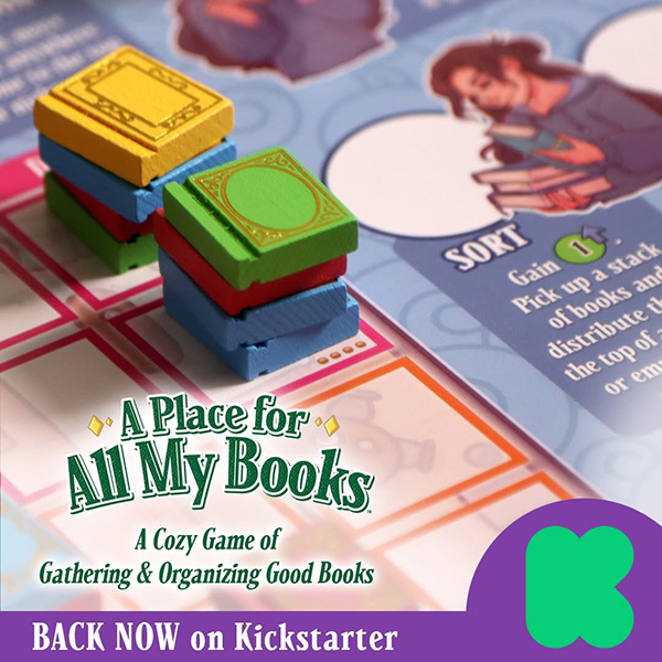
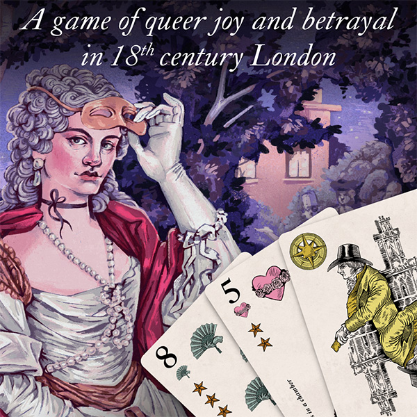
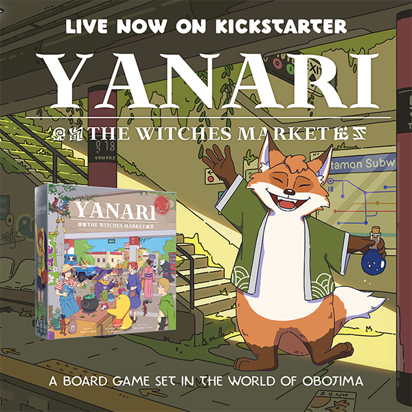
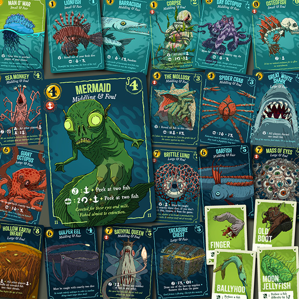
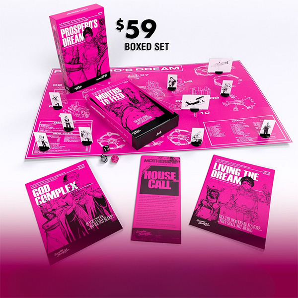
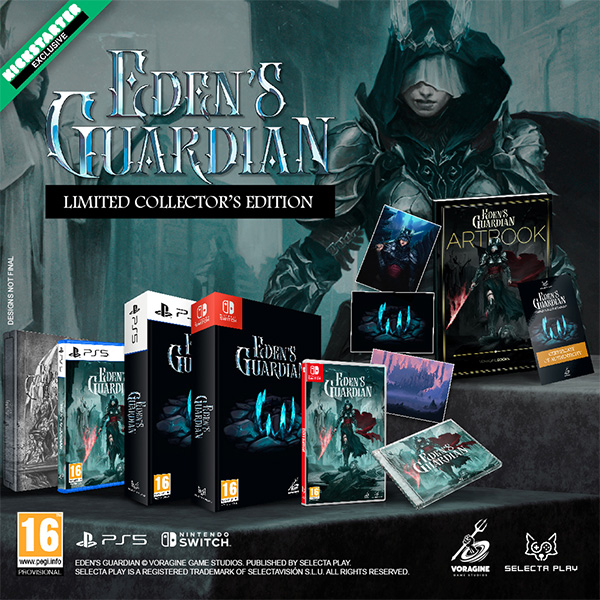
- The assets should highlight clean box images, component close ups, game boards, incentive offerings & key features
- Feel free to provide variants with AND without text.
Examples:
DnD 5E & RPGs
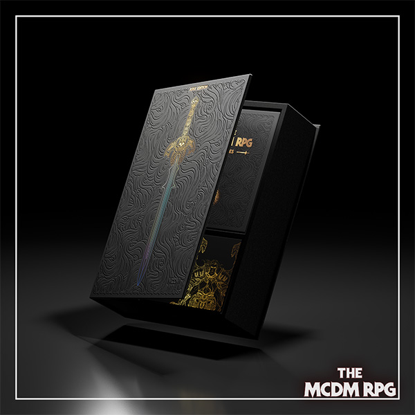
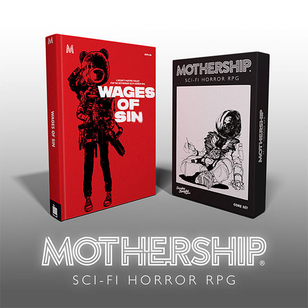
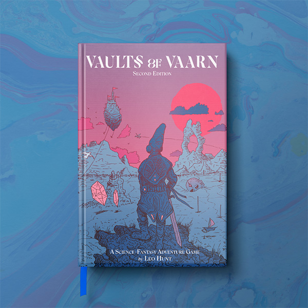
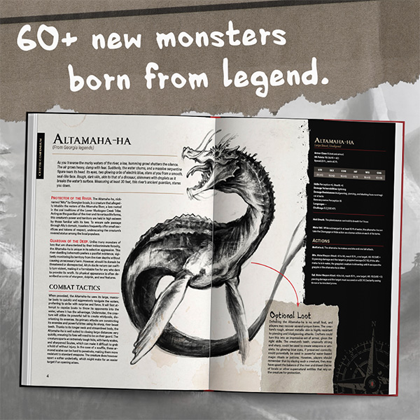
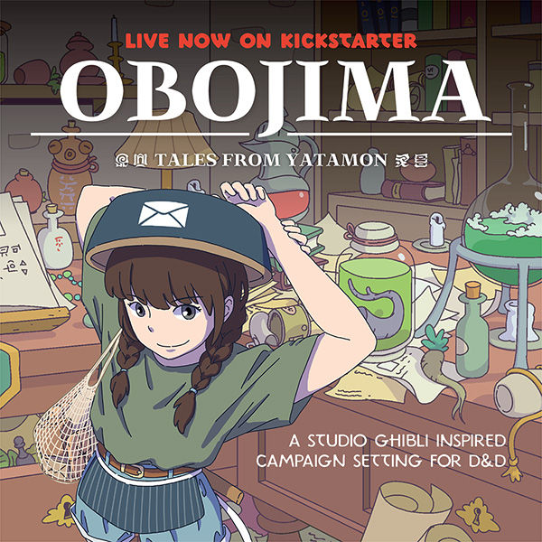
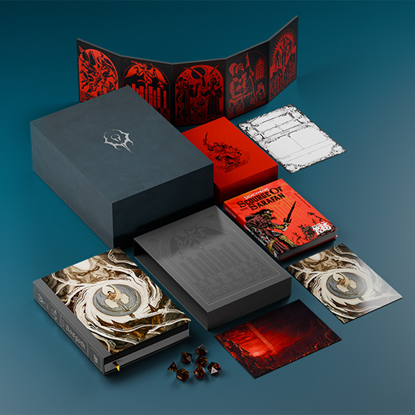
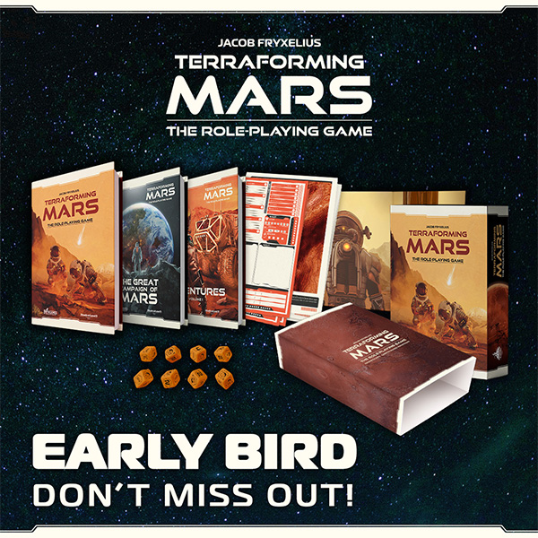
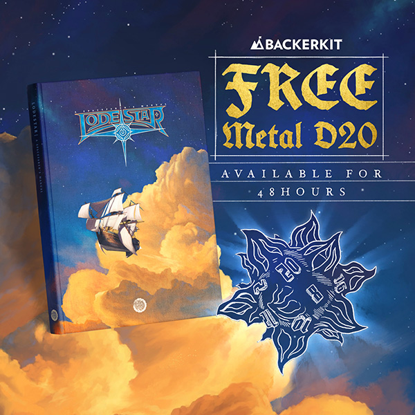
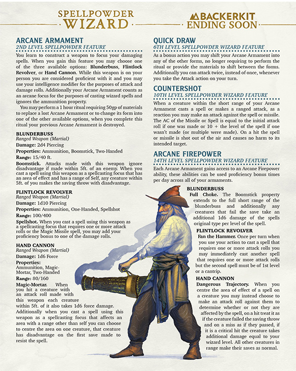
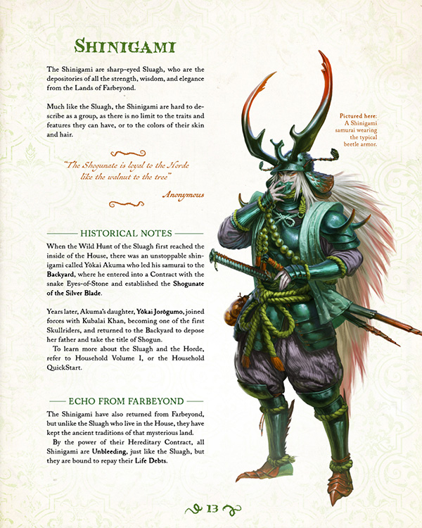
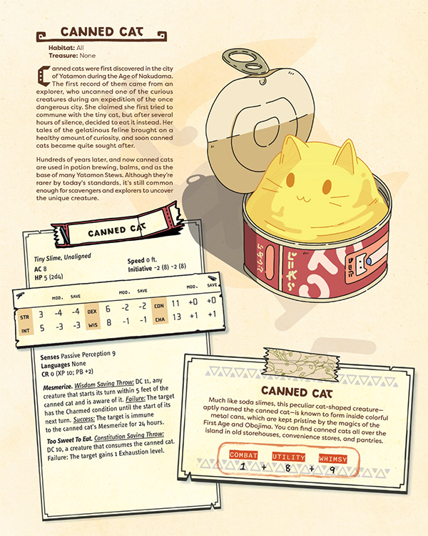
- We recommend highlighting the book render, deluxe/limited edition offerings, single page statblocks/character sheets, book spreads, key features, and early bird offerings/callouts. Ideal dimensions for maximum compatibility is 1080x1080. For stat-blocking graphics specifically, we recommend a resolution of 1080x1350.
Examples:
Tarot
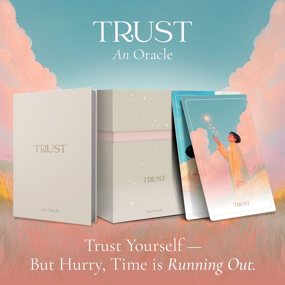
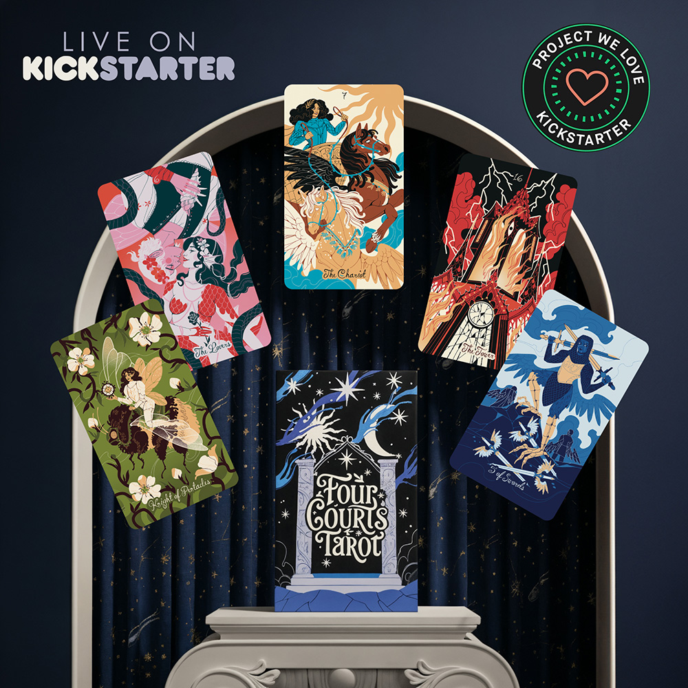
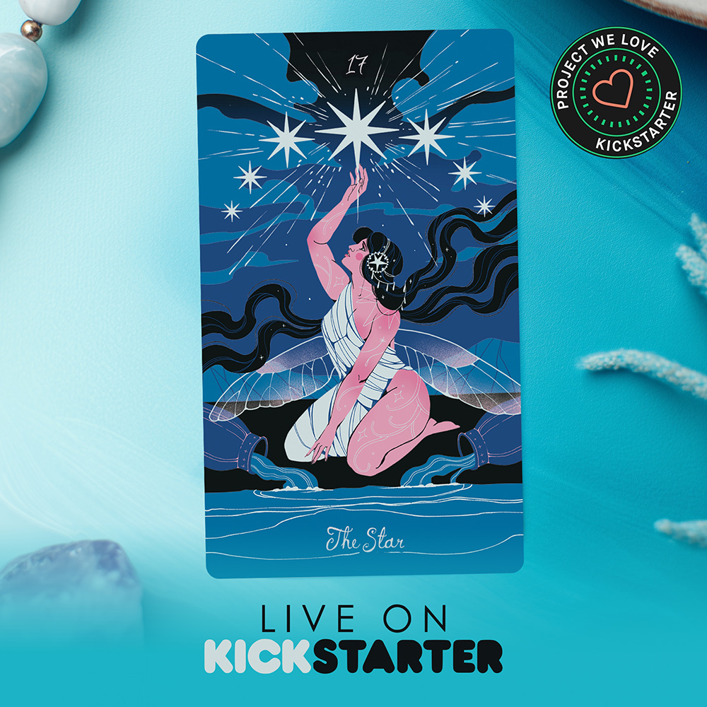
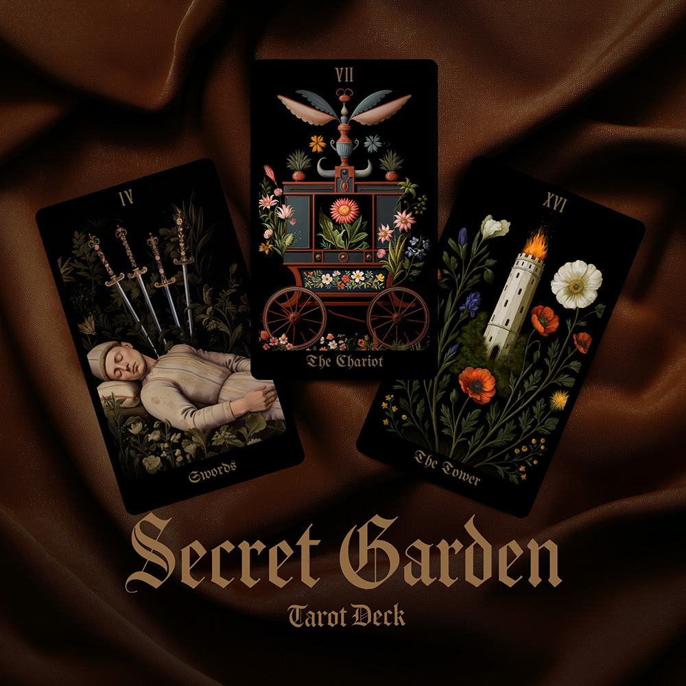
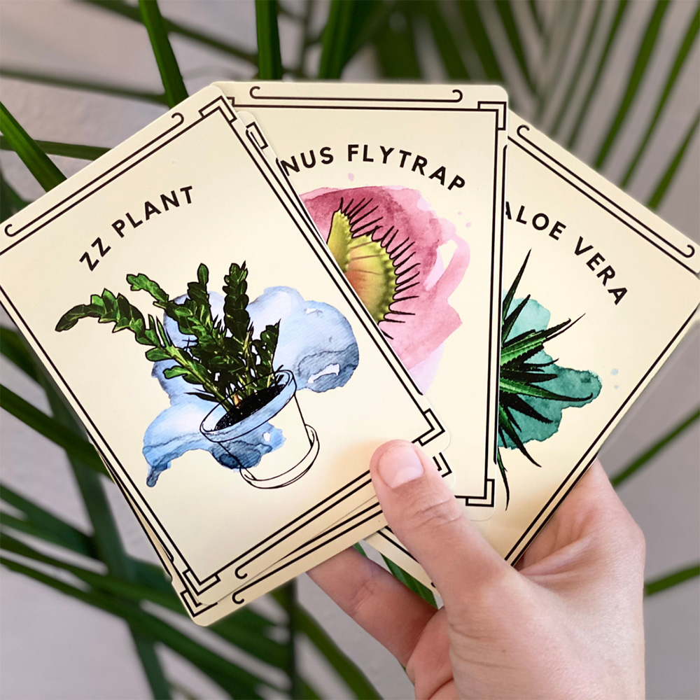
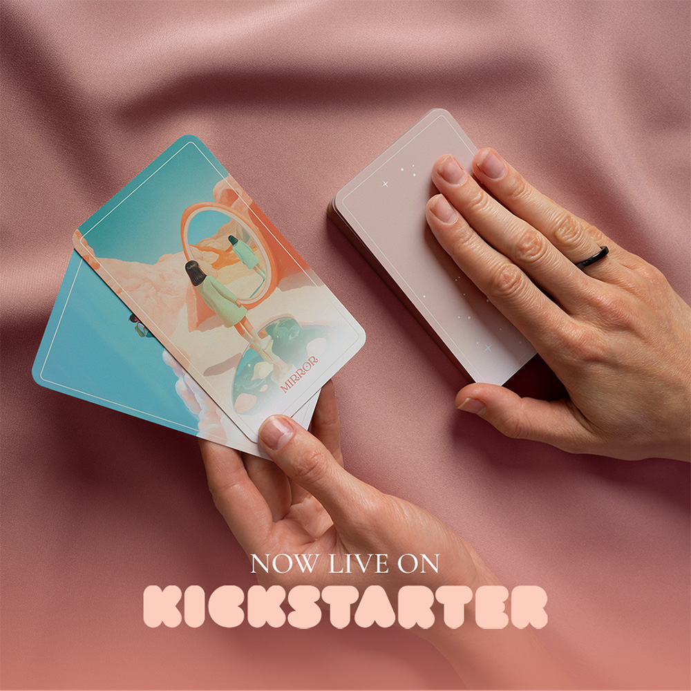
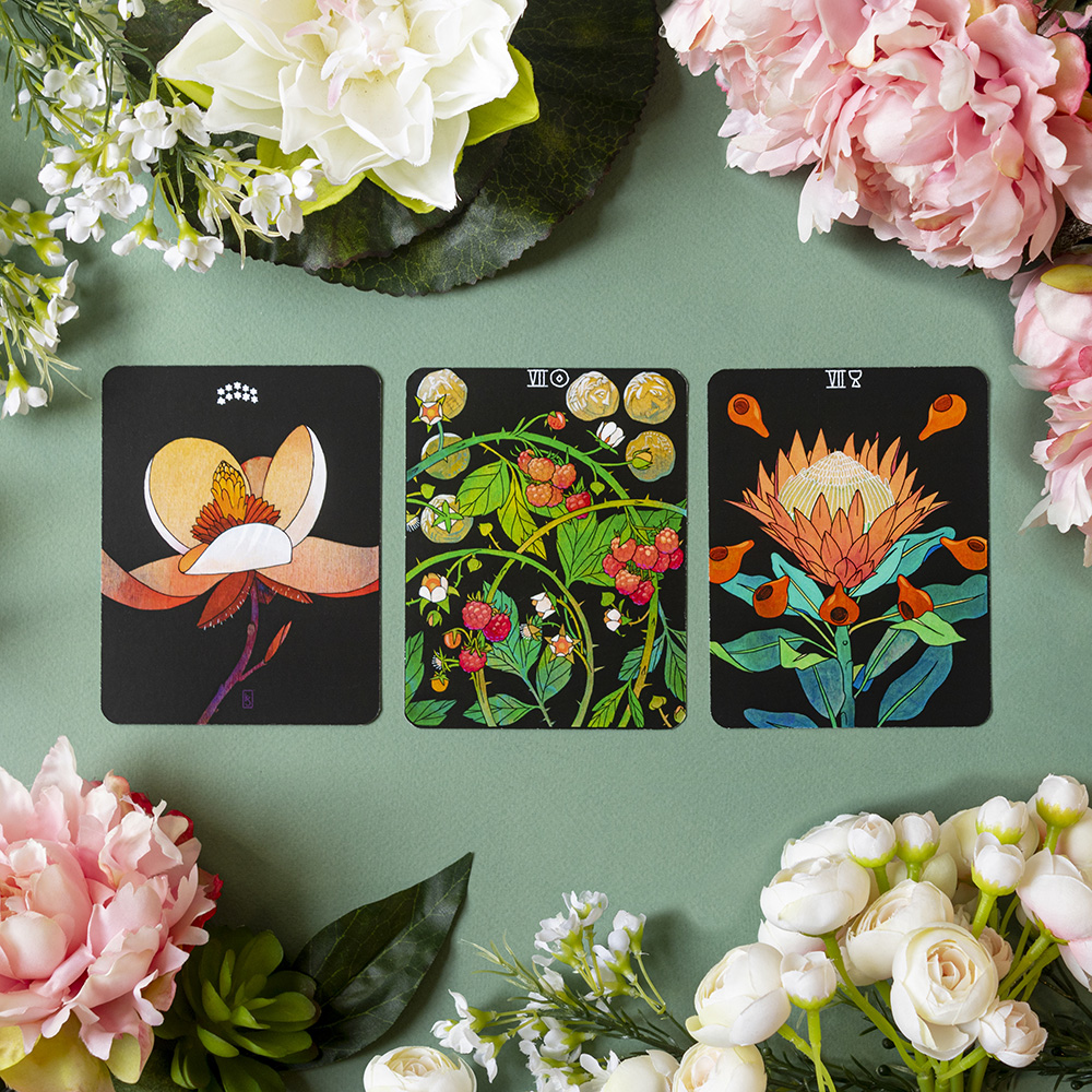
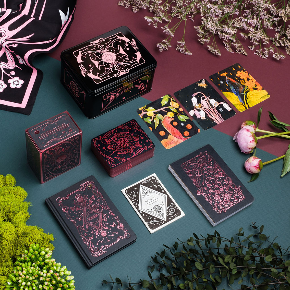
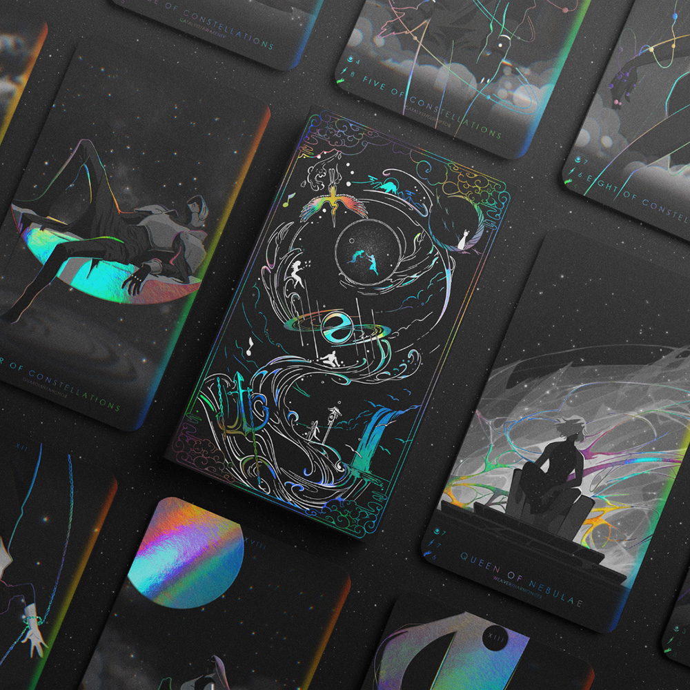
- The highest converting tarot images are the ones that fan out the cards, spread the cards out into a row, and showcase the cards in a unique environment.
- In the examples below, you can see that some of the cards are displayed on a stack of moss, some are showcased on a brown paper bag with interesting items around it, and some are angled in a unique way.
Examples:
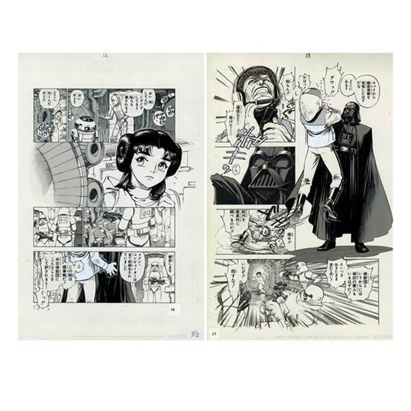
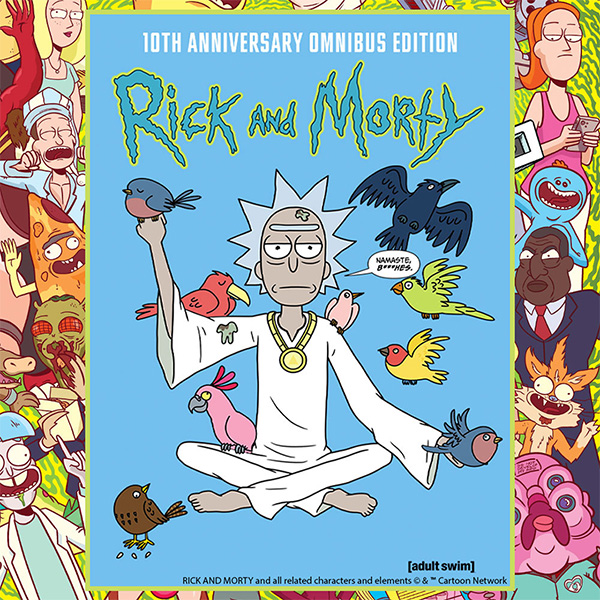
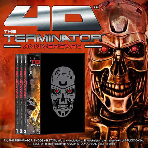
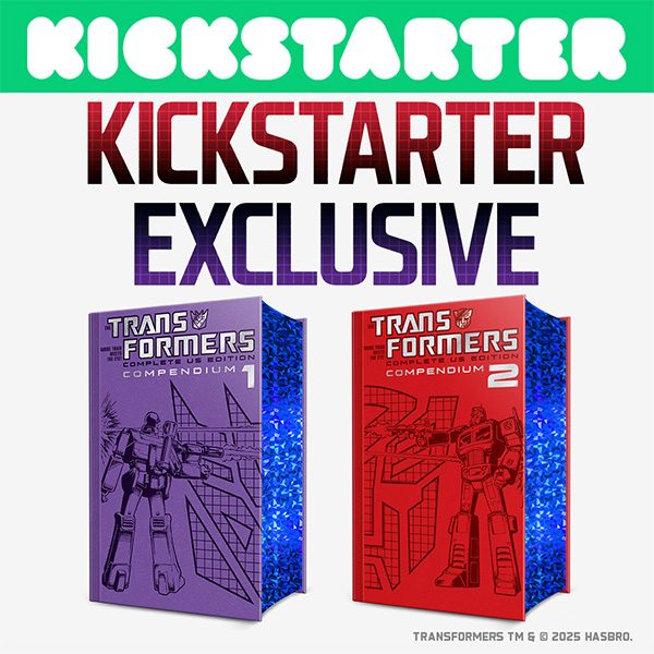
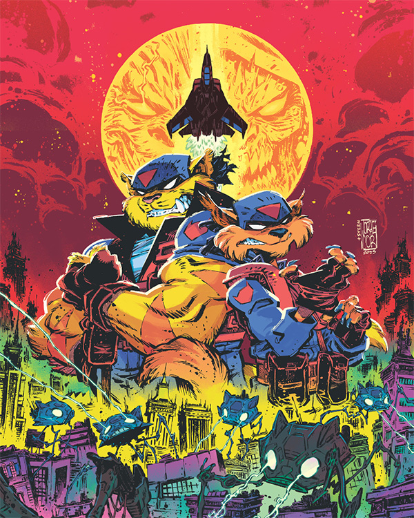
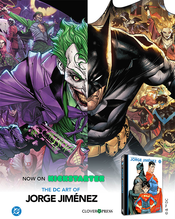
Artbooks, Comic Books, & Graphic Novels
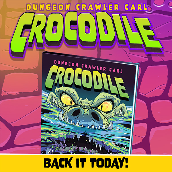
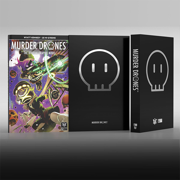
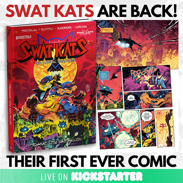
- We recommend any renders of the book on a white background, and/or any other background of your choice.
- Please also provide the page spreads that showcase the artwork.
- Highlight any exclusive, collectors, or limited editions.
Examples:
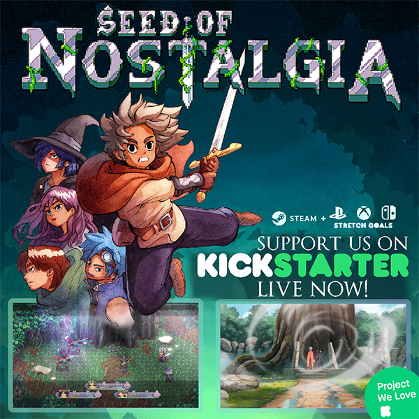
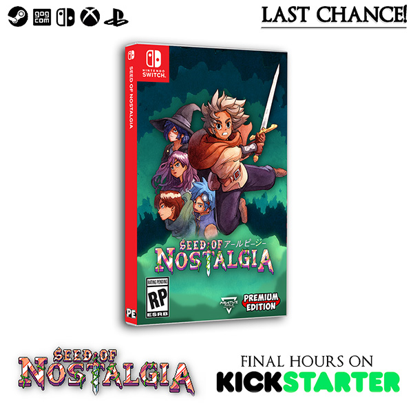
Video Games
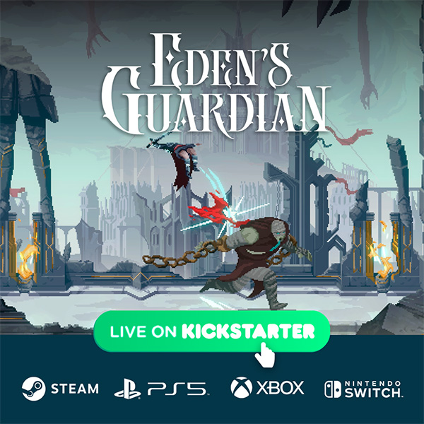
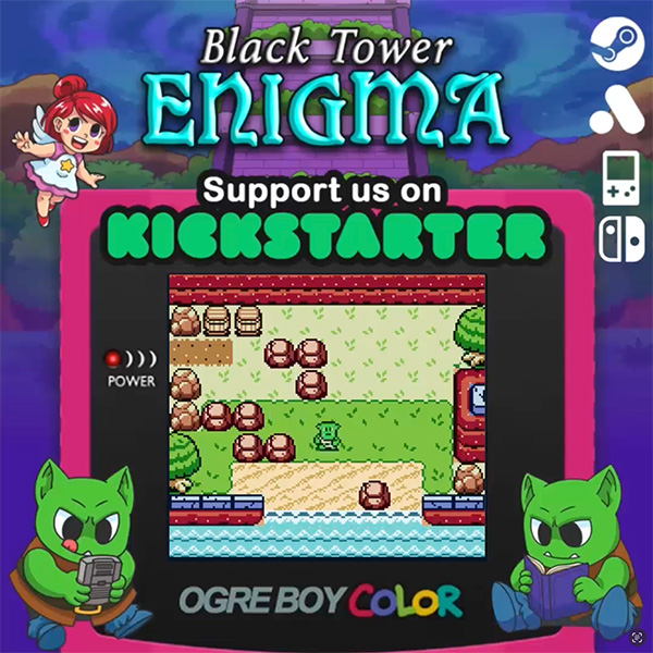
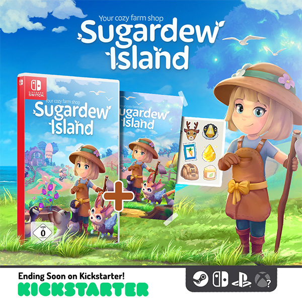
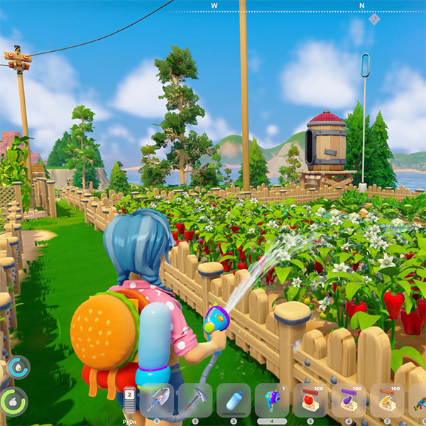
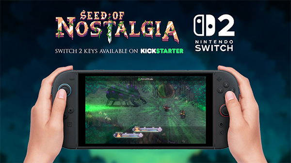
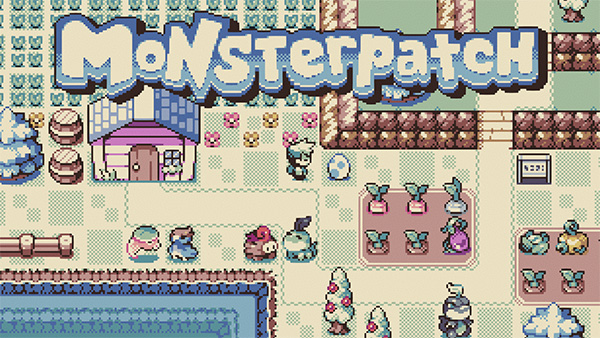
- We recommend providing high-quality screenshots and short clips of the game being played.
Miniatures, Terrain, and STLs
- We recommend any renders of the miniatures unpainted & painted. Both are worth testing.
- We have also seen real-life photos of the miniatures with scenery perform well.
- We also recommend showing off any modular components (see the image of the ship below).
|
|
|
|
Dice
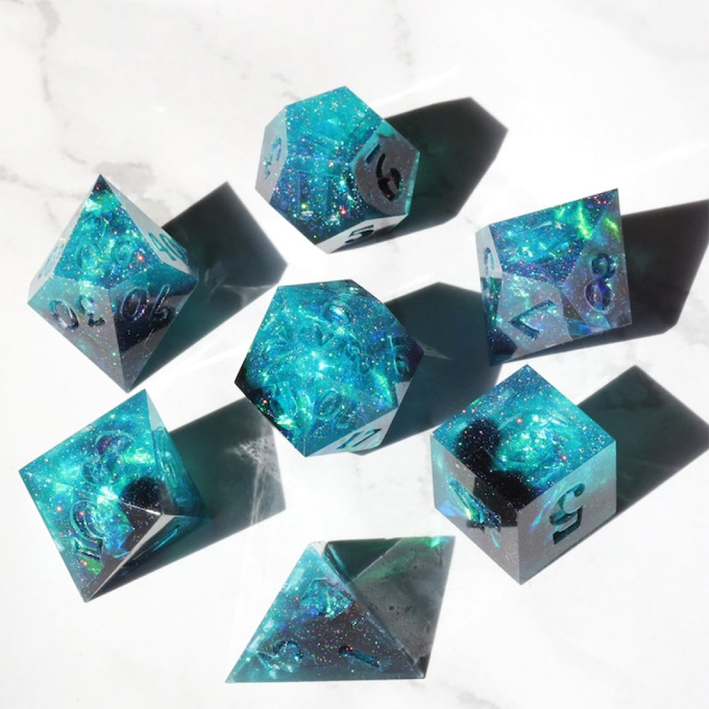
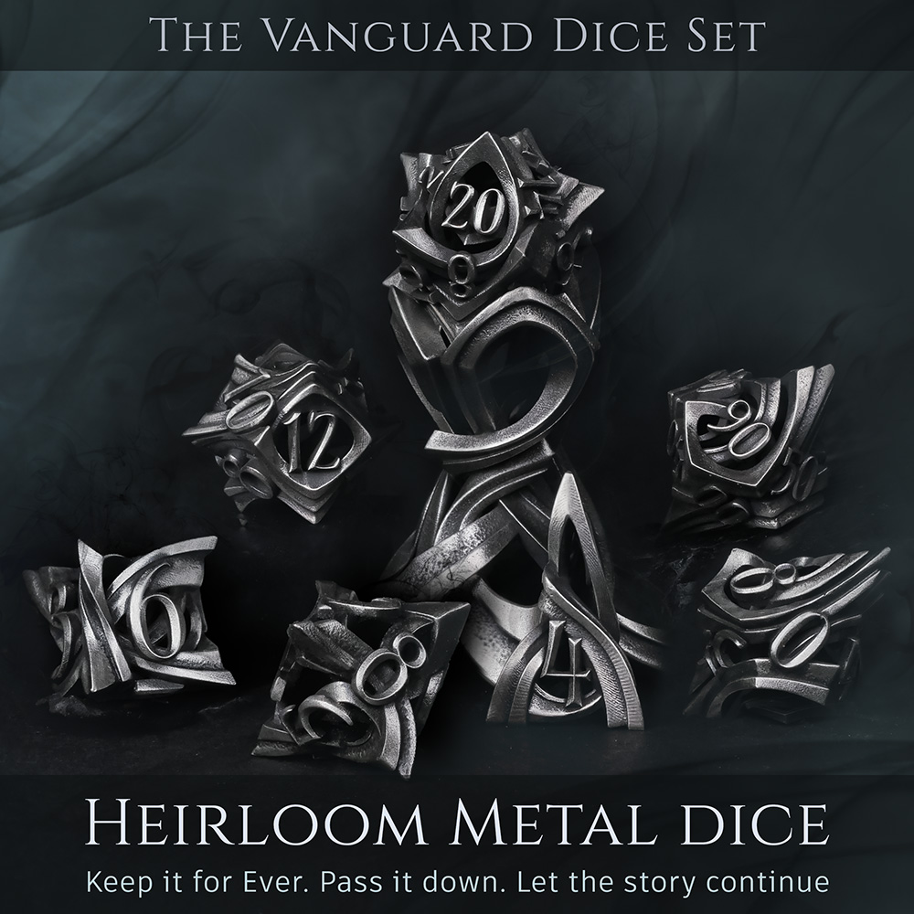
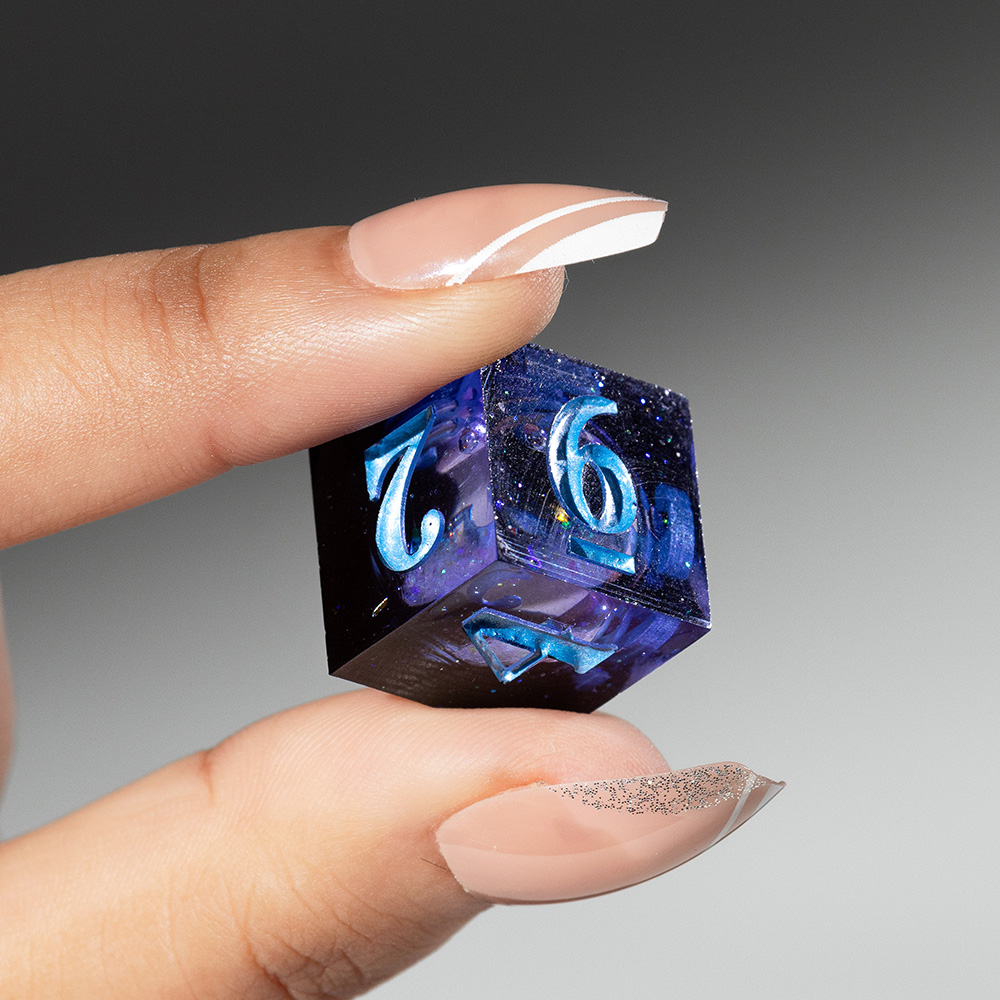
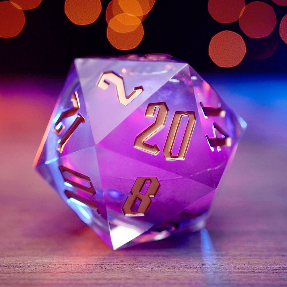
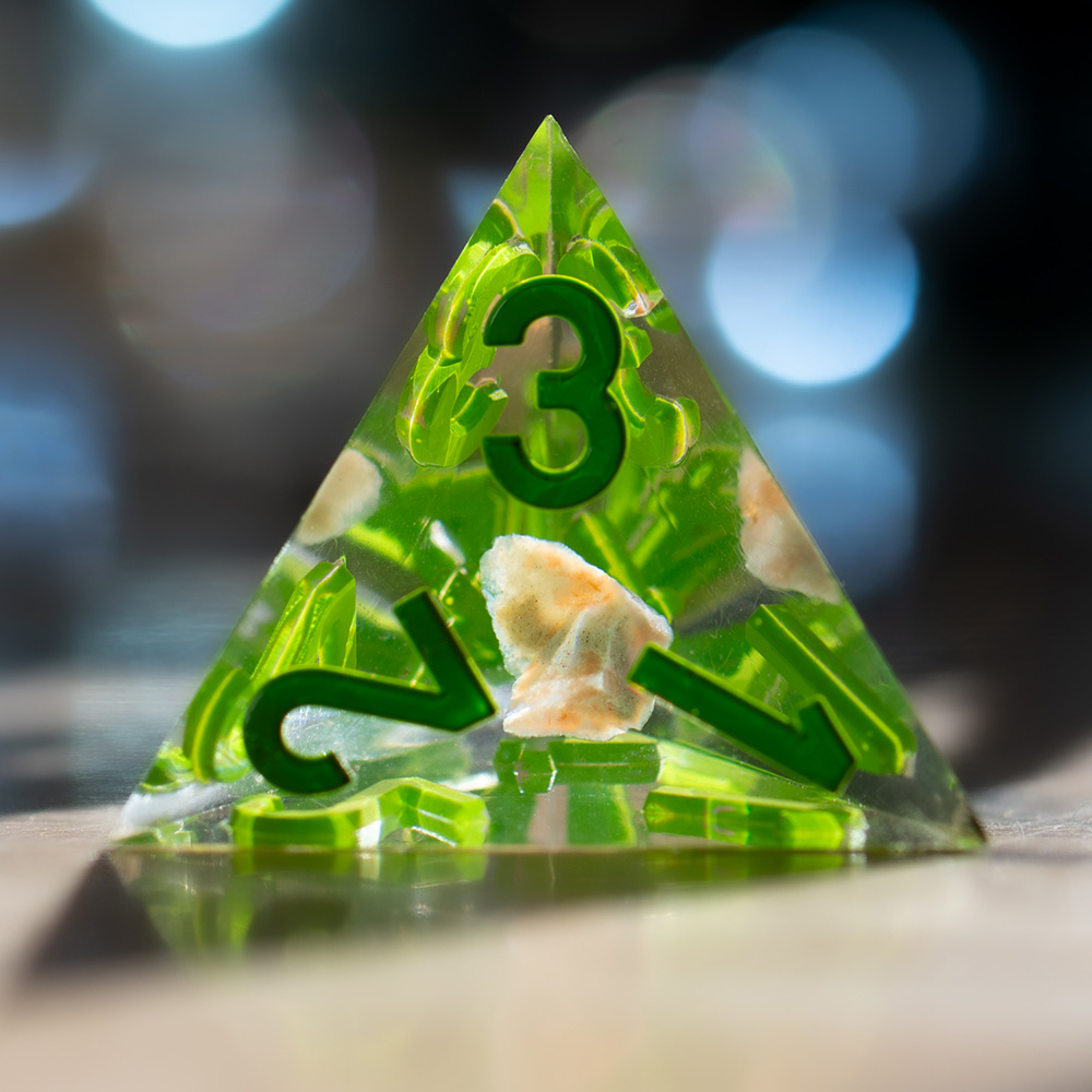
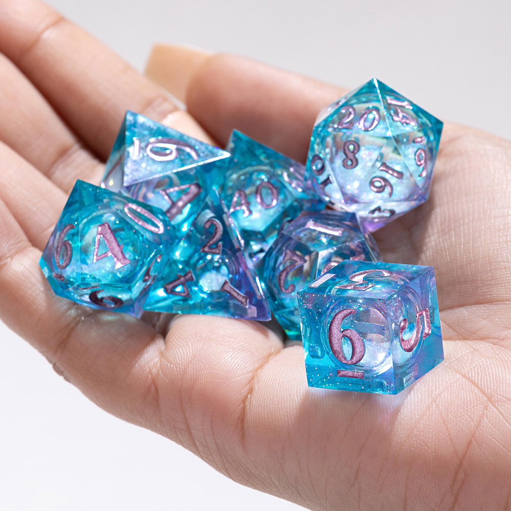
- Recently, we've found collages of multiple kinds of dice have performed the best. Additionally, close-ups of the dice have performed well too.
Plushies
|
|
|
Enamel Pins
|
|
||
|
|
|
|
|
|
|
|
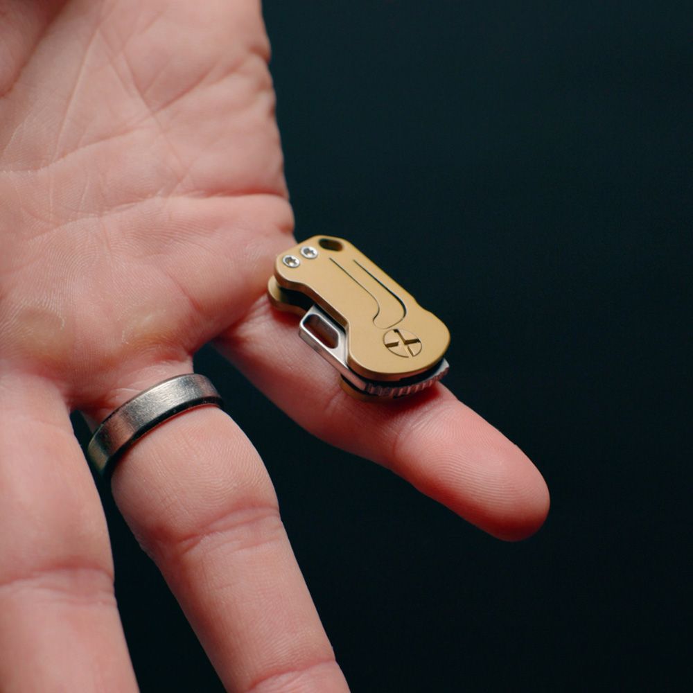
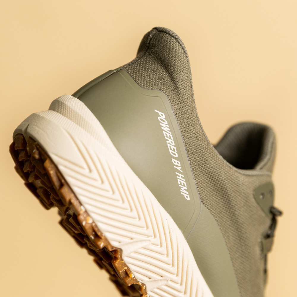
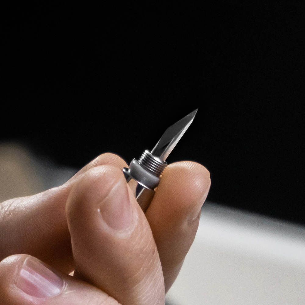
Product Design: technology, EDC, apparel, fitness etc.
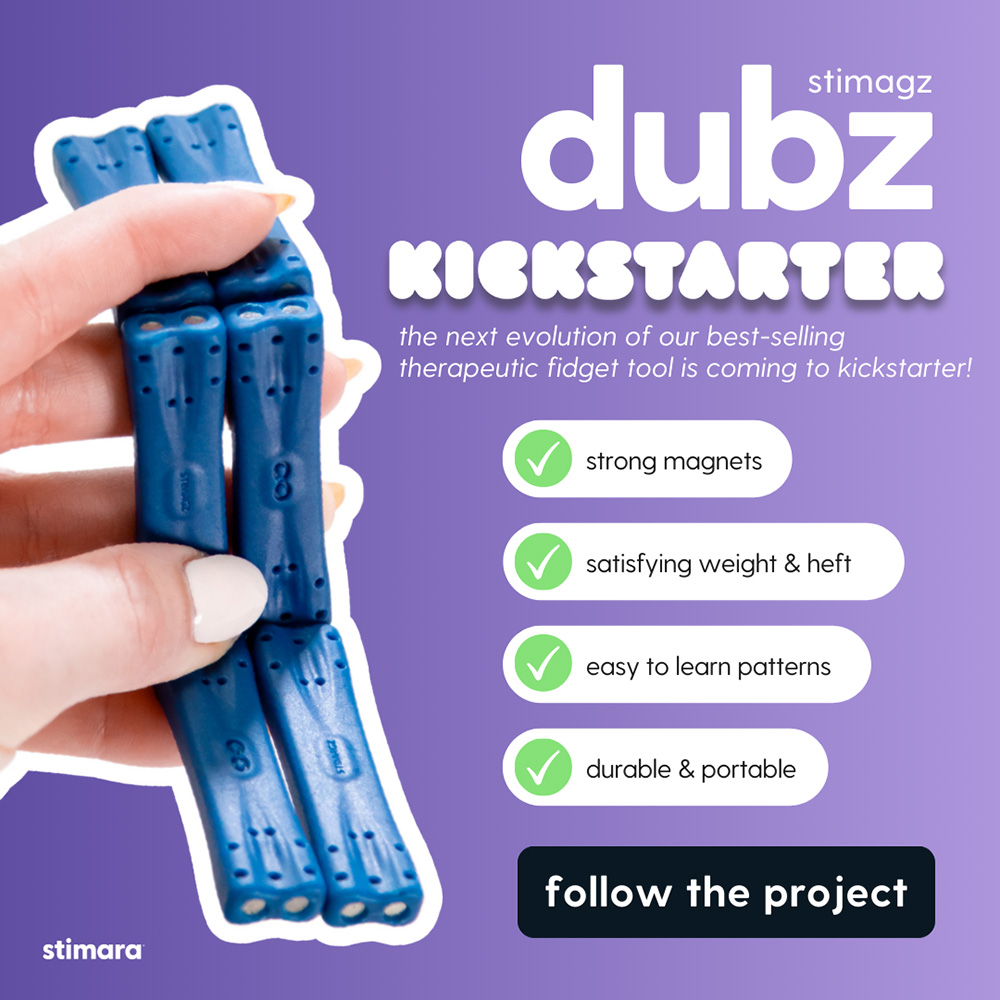
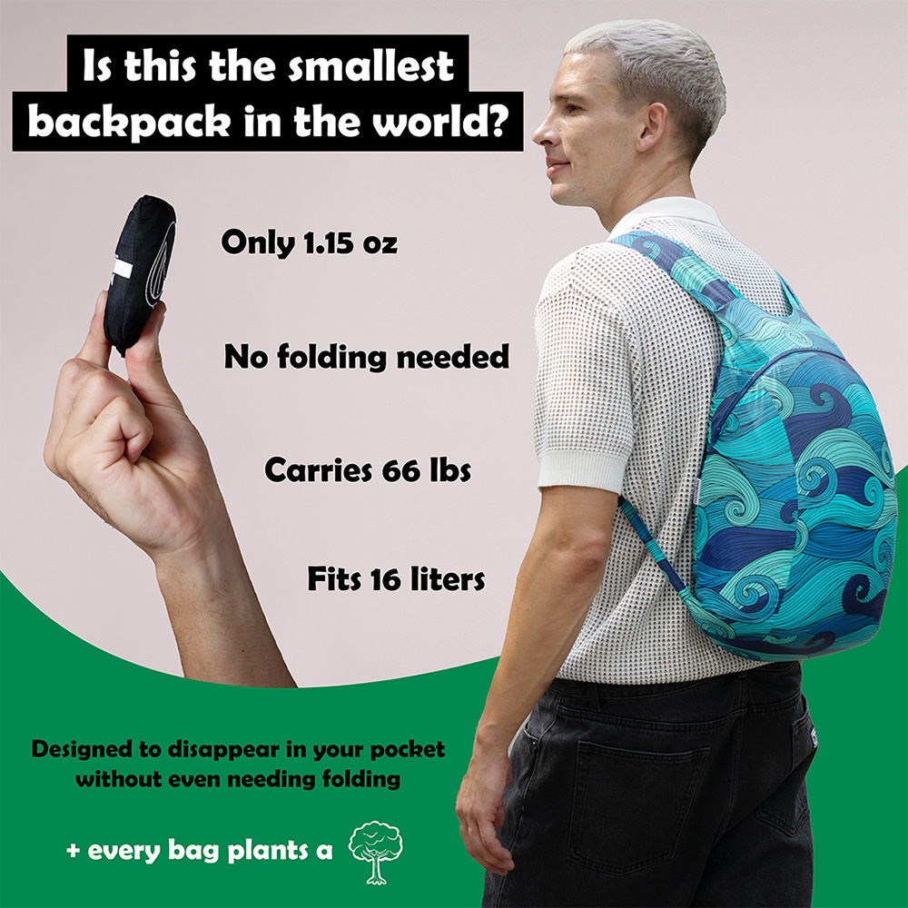
- We recommend providing assets with and without text.
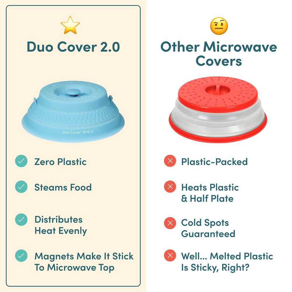
- For ones with text, we recommend calling out 3 to 5 specific features (preferably using a diagram like the belt image below). It's important not to have too many words on the page as it can be distracting.
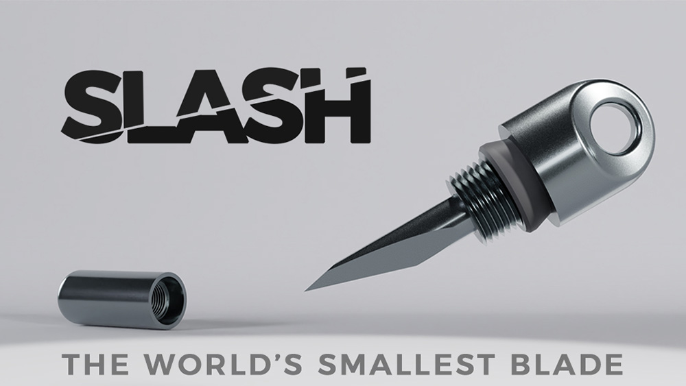
- It’s also a good strategy to call out early bird/discount pricing, or the product's name.
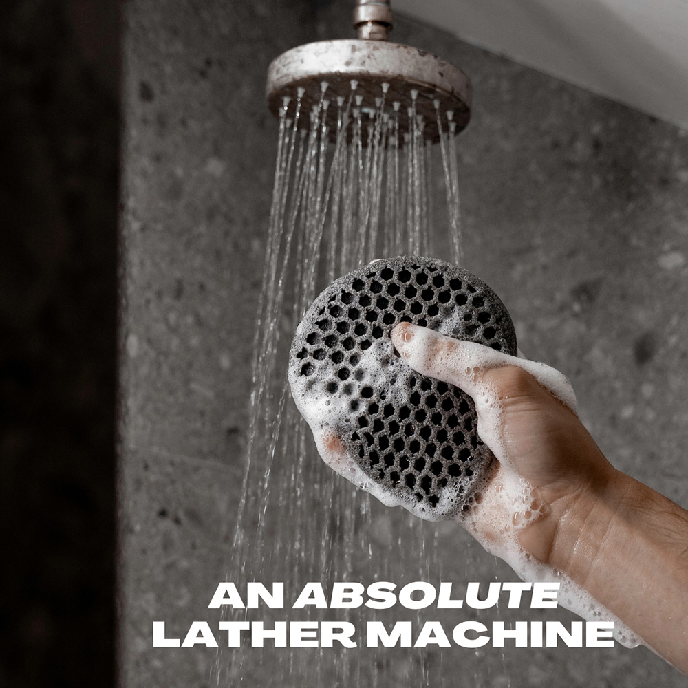
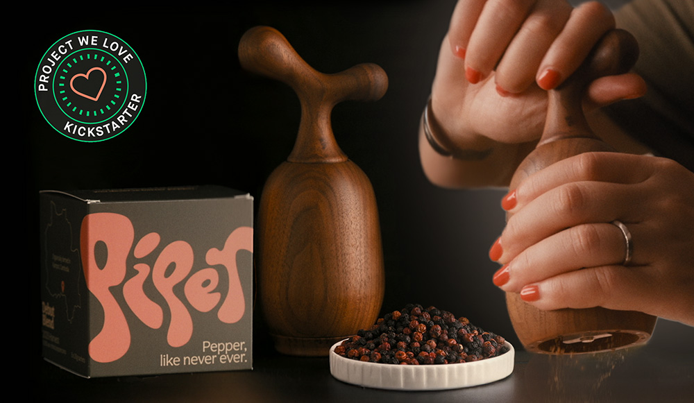
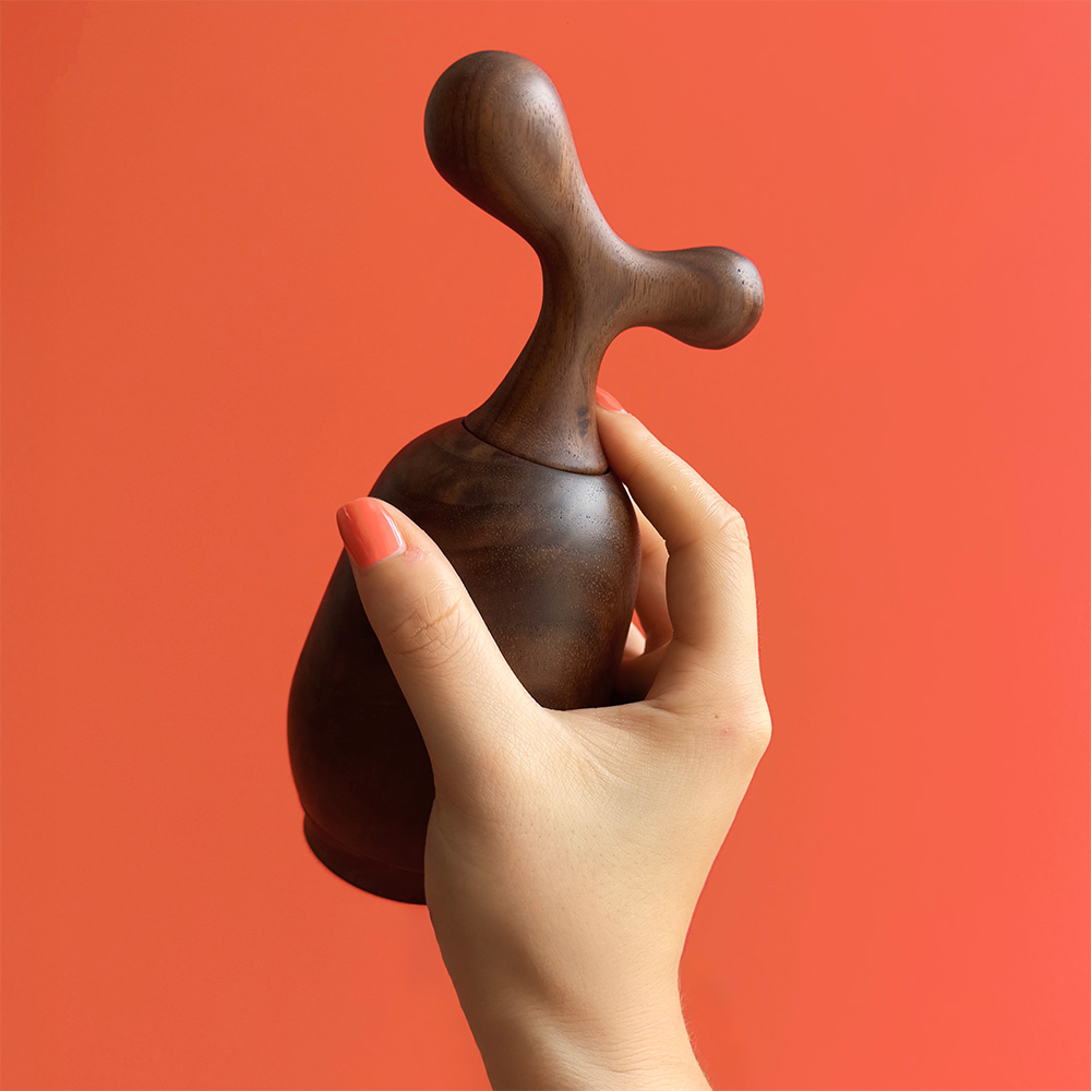
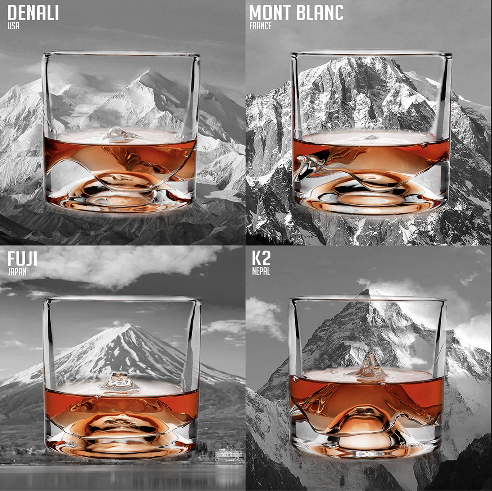
- We also recommend showcasing the project in its natural environment. (ex: table in a living room, cutting board in the kitchen, etc)
- We also recommend providing square videos that are between 15 and 30 seconds.
Examples:
Video Ad Examples:
Fitness
- Images that showcase the product in action have shown the highest conversion rate. We recommend that you avoid photo renders with transparent backgrounds and no logo or other identification. We have seen studio product shots perform well with a logo and appealing background
Additional Info
- Recently we have found that images that feature the unlocked stretch goal components have helped boost performance during the mid-phase of a campaign. We also encourage you to share images with Stretch Goals if we are running your ads, or add them to your own ads to keep momentum strong throughout your campaign.
- If you're launching on BackerKit Crowdfunding and you need BackerKit logos to help mock up your assets, you can download them here.
.png)
