How to create images for your campaign

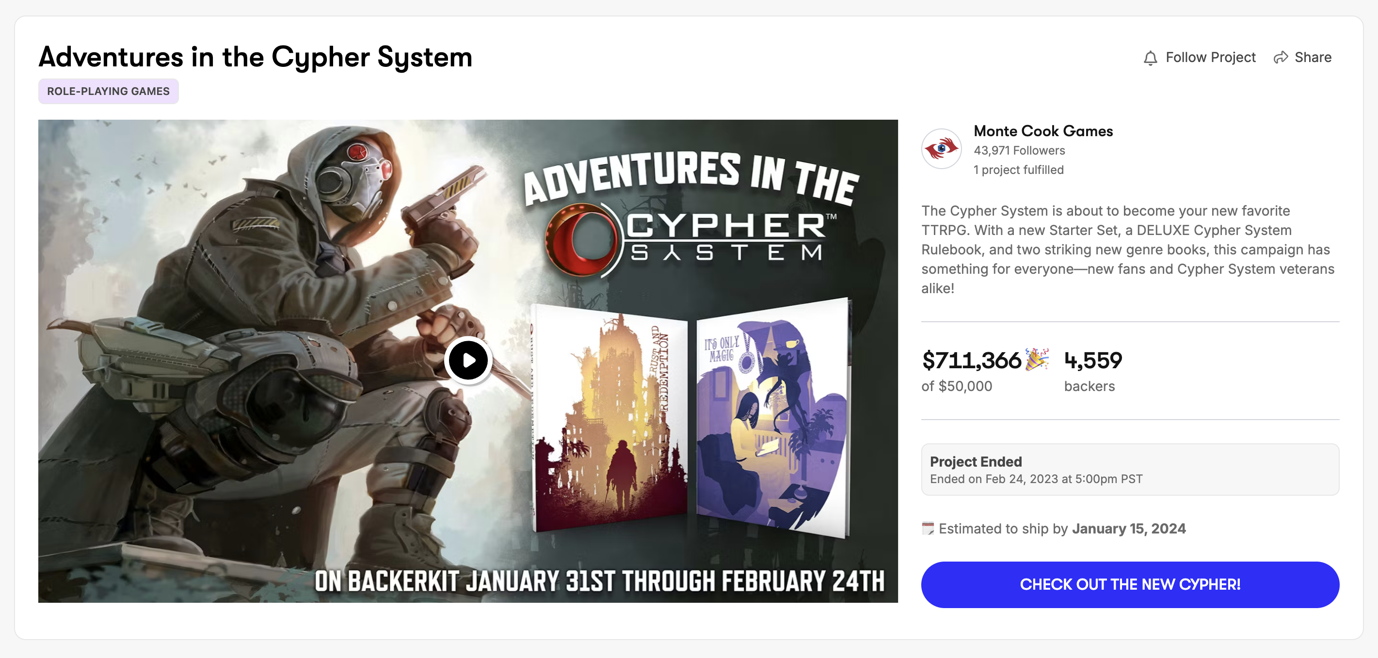
A well-crafted Project Image has the potential to be the digital equivalent of an alluring book cover. It's usually the first thing backers see when scrolling through a sea of content, and it plays a critical role in capturing their attention and encouraging them to click on your project.
The story told by the images on your campaign page doesn't need to win an Oscar, but they do need to be clear and concise. Through our many years of research and testing, the majority of successful campaigns use beautiful images to weave a tale from beginning to end for their backers to follow.

Understanding Project Image Basics
Before you dive into creating your project image, it's crucial to understand the fundamental elements that make a campaign image effective:
- Clarity: Your image should clearly convey the topic or theme of your project at a glance.
- Contrast: Use contrasting colors to make your subject pop against the background and catch the viewer's eye.
- Typography: Include a bold, easy-to-read title that complements your project.
Image Selection
Select high-quality images that capture the essence of your campaign. They should be visually appealing and relevant to your project. Remember, clarity is key – avoid images that are too busy or cluttered.
Even if your main rewards are prototypes, include your draft drawings in hi-res. Backers love seeing the design process, it makes them feel like they are apart of the magic.
If you have physical rewards, take photos from different angles, under different lighting, from different devices to find the images that will pop off your campaign page.

Design Tools
You don't need advanced design skills to create an effective thumbnail. Many free online tools, like Canva and Adobe Express, offer user-friendly interfaces with pre-made templates to simplify the process.
Pixabay is also a good resource for free stock images you can use for backgrounds for add-ons, pledge levels, etc.
If you don't have enough time or the creative eye, you can outsource your project image to friends, family members or paid websites like Fiverr or Upwork.
Crafting the Campaign Image
- Choose a Template: Select an image template that aligns with your project's theme. Most tools offer a range of options tailored to different styles.
- Image Placement: Insert your selected image into the template. Ensure that the image is positioned prominently and goes edge to edge, or fades into the background color.
- Add Text: Include your project title or a concise, attention-grabbing phrase. Use a legible font and place the text strategically so it doesn't cover crucial parts of the image.
- Colors: Incorporate colors that complement your project's content and create a sense of visual harmony. Make sure the text is easily readable against the background.
- Contrast: Enhance contrast between the subject and the background to make the image stand out. This draws the viewer's gaze to the main focal point.
- Icons or Logos: If you have a logo or brand icon, consider including it subtly on the main image to reinforce your brand's identity.
Tips & Tricks
-
Create images for Story Section Headers — On your Story Sections page, there is a setting to turn off Story Section Headers as Text


-
Turn your Pledge Levels into Images (Add images to your Story Sections)

-
Create Images for Stretch Goals

-
Turn Add-ons into images

Campaign Image Specs:
- PNG, JPG, GIF up to 10MB
- Image should have an aspect ratio of 16:9.
- Image dimension should be at least 1280px × 720 pixels (width × height).
- If you are adding text or logos in the banner image, add it in the center. This ensures that they will be visible on all devices, regardless of screen size. The image can be cropped or extended depending on where it will be used.
- Image will be used as your video preview image if you add a project video.
All Other Image Specs:
We recommend sizing images on the campaign page to a maximum of 1200 pixels wide, so they look large enough on desktop and tablets. On mobile devices, images get resized by the browser anyway, and that 1200px size is enough to look crisp on smartphones with high-PPI “retina” screens.
While you are able to use images larger than 1200 pixels wide, reducing image dimensions will keep the file sizes reasonably small, resulting in faster image loads.
.png)


